Send IT.
(Arc’teryx Campaign)
SPRING 2025
NOT MADE IN ASSOCIATION WITH ARC’TERYX
CAMPAIGN MARKETING
BLENDER RENDERING
LAYOUT DESIGN
PHOTOGRAPHY

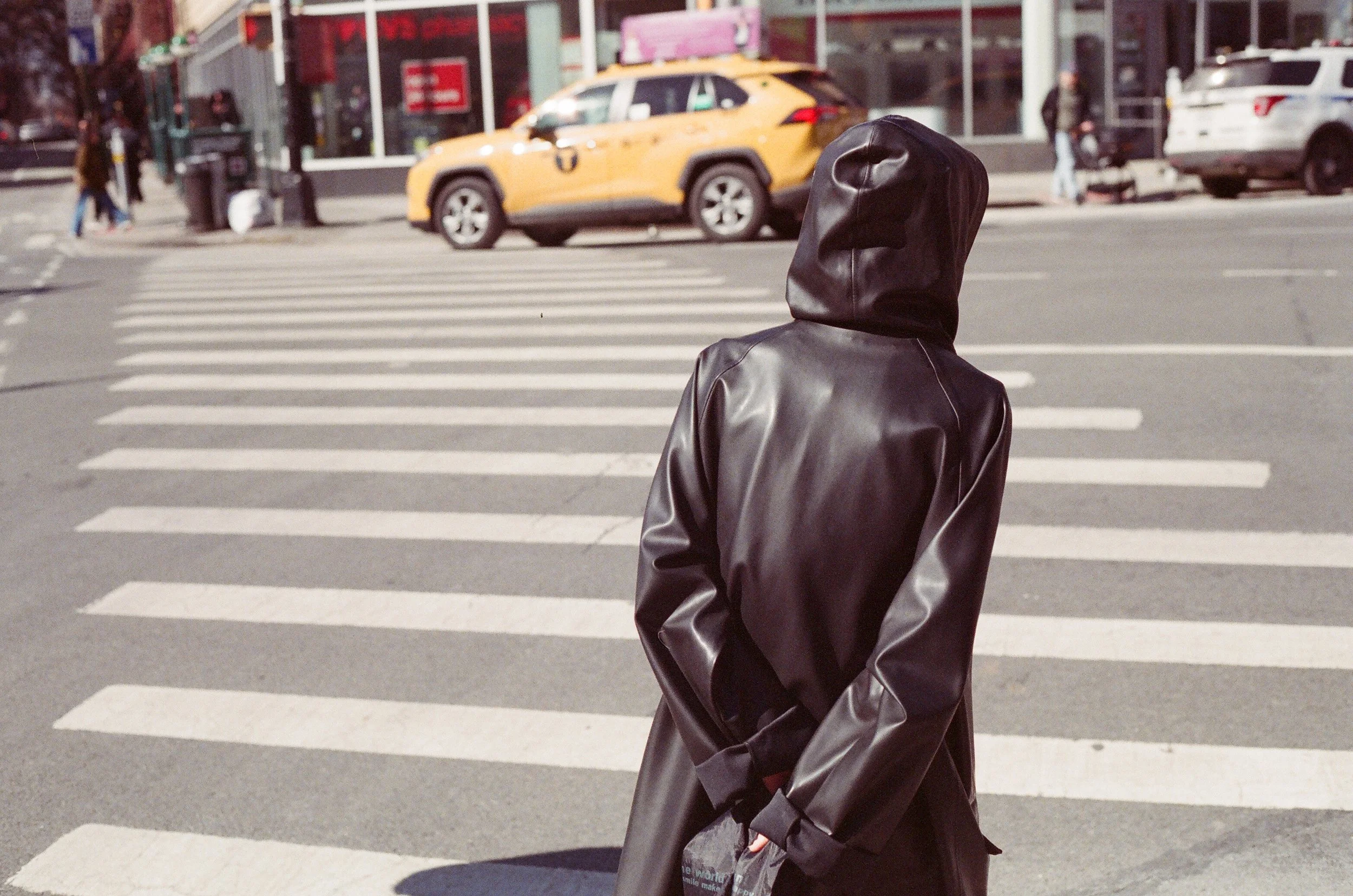
SEND IT. is a marketing campaign designed with the Arc’teryx brand in mind. It focuses on bringing a relatability to the brand, advertising it not only to those facing extreme alpine conditions, but also to the city-dwelling population for their everyday life.
PROCESS OVERVIEW
01
Ideation
Creating mood boards, sketching out concepts, and hashing out a couple different project solutions.
02
Assets and Identity
Upon choosing the most promising solution, bringing ideas to life with combination of images and type.
03
Retail Design
Following implementing the design and identity, working the identity into a space and experience.
01

Brand Research
I began this project with a deep dive into the brand and the population they serve. While their advertising leaned heavily on extreme conditions and high-performance use cases, my research revealed a wider audience of people incorporating the brand into casual, everyday city life. This insight shifted the campaign direction toward reaching that broader consumer base. Out of several creative directions, I landed on the phrase “Send It.” The phrase nods to the brand’s roots in extreme sports while reframing it for the everyday.

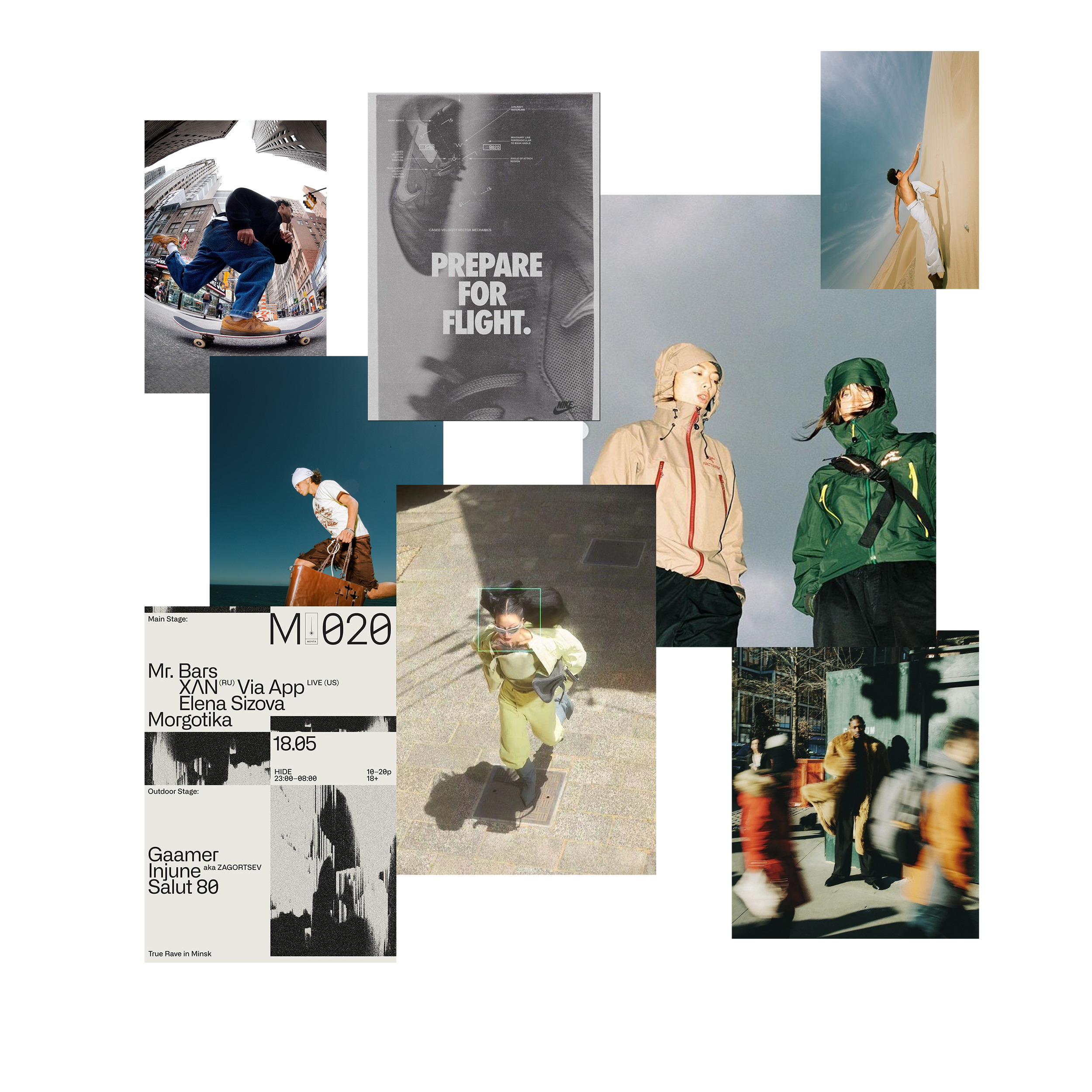
MOODBOARDING
Thinking about the identity of the campaign I was trying to build, I brought in visual inspiration coupled with these leading terms:
Speed
Movement
Clean
Exciting
02
Assets and Identity
Building on the “Send It.” slogan, I designed a visual identity that is bold, simple, and memorable. I chose a typeface that balances punchy impact with refined clean lines. The campaign started as a poster design and was then adapted to a plethora of different formats, from subway posters to social media posts.

03
Retail Design
To bring the campaign into physical space, I drew inspiration from the idea of movement and the angular forms of climbing volumes. These shapes reflect both the brand’s performance roots and its versatility in everyday life. Within the retail environment, I incorporated dynamic elements like LED screens and projection mapping to highlight the range of product use cases. Once I had renders built in blender, I brought them into Flora AI to increase the fidelity on the renders I was able to build out.