Confidence In motion
nike Campaign

WINTER 2026

NOT MADE IN ASSOCIATION WITH NIKE

CAMPAIGN MARKETING

LAYOUT DESIGN
CREATIVE PHOTO EDITING
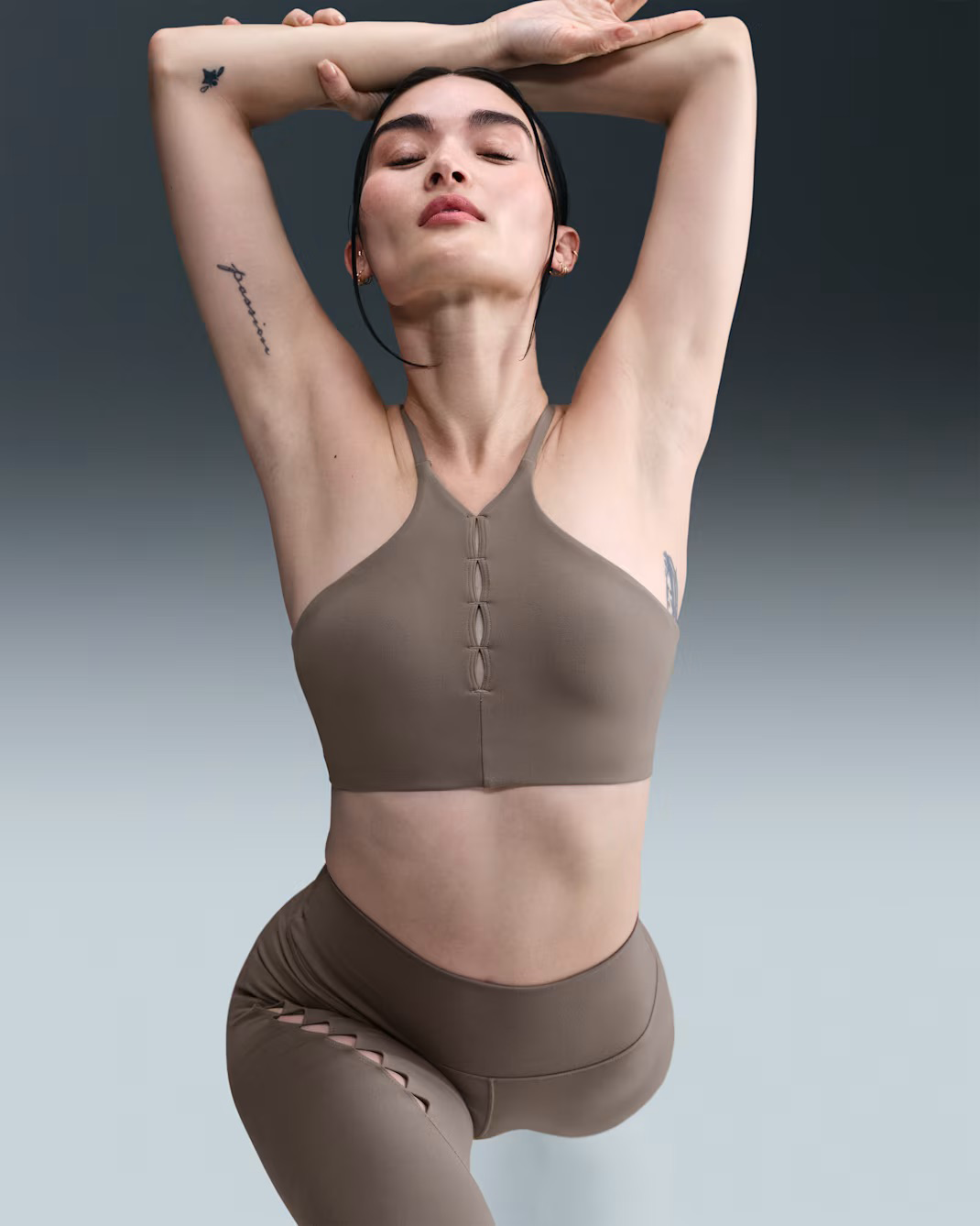
The intersection of Fashion and Motion

As a runner, I have been paying a lot of attention to how running brands are (and aren’t) advertising their products and have been super inspired by some smaller brands like Satisfy and Bandit. One of the things I find them doing is advertising their product like designer clothes, bringing unique, brand forward expression to their marketing.

“Confidence in Motion” is an ad campaign built around bringing a refined technical face of the Nike brand.

PROCESS OVERVIEW

01

Ideation

Creating mood boards, sketching out concepts, and hashing out a couple different project solutions.

02

Assets and Identity

Upon choosing the most promising solution, bringing ideas to life with combination of images and type.

01

Brand Research

I began this project with look into Nike and the audience it serves. While much of Nike’s advertising traditionally centers on peak athletic performance and competitive intensity, my research surfaced a broader reality: activewear is just as present in everyday, urban life as it is on the field or track. This insight reframed the campaign toward positioning performance apparel through a high-fashion lens. I arrived at the phrase “Confidence in Motion”. It reflects Nike’s performance heritage while elevating it into a mindset, suggesting that movement can be expressive, stylish, and self-assured.

MOODBOARDING

Thinking about the identity of the campaign I was trying to build, I brought in visual inspiration coupled with these leading terms:

  • Movement

  • Technical

  • Refined

Campaign Identity

When thinking about the idea of bringing the technical simplicity of Nike’s products to a more high fashion space, bringing simple typeface treatment to the campaign was the obvious solution. From this type treatment, I was able to create a visual identity around the incorporation of information to guide the viewer to the product in a bold but simple way.

To offset the simple type treatment, I used creative photo editing to bring a sense of motion to the images of the products, leaving the brand and the feeling of movement to bring the consumer in and keep them interested in the product.

02